For this project I was assigned to a group of 3. our project brief was to use playfulness to bring the community together with the assistance of "Nudge Theory." Nudge encourages us to consider easing or suggesting people towards something rather than forcing it upon them. thus making it seem like they came to the decision all by themselves.
WE Started by doing an analysis of the place. Taking into the physical, spirit, atmosphere, and energy of the place.
using that place analysis we generated some initial concepts. We found the area above marked with the red icon to be where we wanted to design our project. It is a divider between the older and newer parts of the Weinland community. the divider was wide enough to create and area for interaction.
WE generated five different ideas but we settled on the idea of a balance beam/floor is lava theme. We felt that with the limited space and the transitory spirit would be a good match. we decided that the nudge would be that able bodied people of all ages have that natural draw to walk on curbs or beams that are even slightly elevated. having a safe way to do this should be encouraged. That was our goal.
we proceeded to break into rapid ideation and get out as many ideas a we could on how this series of beams or steps or teeter totters would manifest. What theme would it have and what form would it take? there are pages and pages of iterations so here is a taste.
we considered three serious options. Geometric. Architecture. Natural. WE took a day to split of and each of us took one idea to flesh out a little bit more than thumbnail sketches. I was given the architecture theme. I decided to lean into the architecture of downtown Columbus. The mixture between busy streets, modern skyrise, and the classic brick buildings of historical downtown.
we came back together with our sketches and did one final round of mass ideations. it was important that the shapes of our beams and steppers were fitting to the area. this meant that we wanted there to be influence, but not a direct reflection.


we broke them down to some simple forms in hopes of finding just the right one. to our surprise we found the simpler the better.
this became our final form that would inspire the rest of our design and would launch us into the building phase. This shape is supposed inspired by the center divider itself with a long almost pill shaped form with a line through one side. This line indicated where the sidewalk went.
before purchasing our materials we wanted to get a sense of 1:1 scale and worked up these flat prototypes and deduced our final measurements from there.
with that confidence we purchased some 3/4" plywood, scavenged some similar wood and got to work. I was most familiar with power tools and carpentry so I took the lead in this phase of the project. Making the measurements, cutting, sanding, and nailing.
to make the curved edges of the steppers we had to get creative. We went with chipboard because we felt that slats wouldn't emulate as closely what we were looking for. Here is a wrapped step
The final deliverable is a working prototype and so we had to make sure that they held weight. They did so with style.
we made a set of six prototype steppers in the shop. we wrapped them all in chipboard and begun painting them. Color was something that proved to be a big challenge for us to overcome. We didn't have the funds to get brand new cans of paint so we had to make do with the paint we could get from past projects. WE were able to get close to the colors we wanted and mixed the rest. Our colors were pulled from the homes themselves in the neighborhood.
here we catch our first glimpse of our completed steppers. we had to make sure we did one last test before we put them in the field. Here we set the distance between the steppers to test a challenging but equally safe distance apart.
wood was never supposed to be what the final design would be. WE considered wood, concrete, plastic, and metal. We decided that the best option for the real world design would be recycled plastic bags. We wanted to bring in an environmentally conscious approach. Above you can see the shredded plastic bags and the injection molded material test below it. an important thing for us to test was the inclusion of texturing for keeping the project safe to navigate when wet.
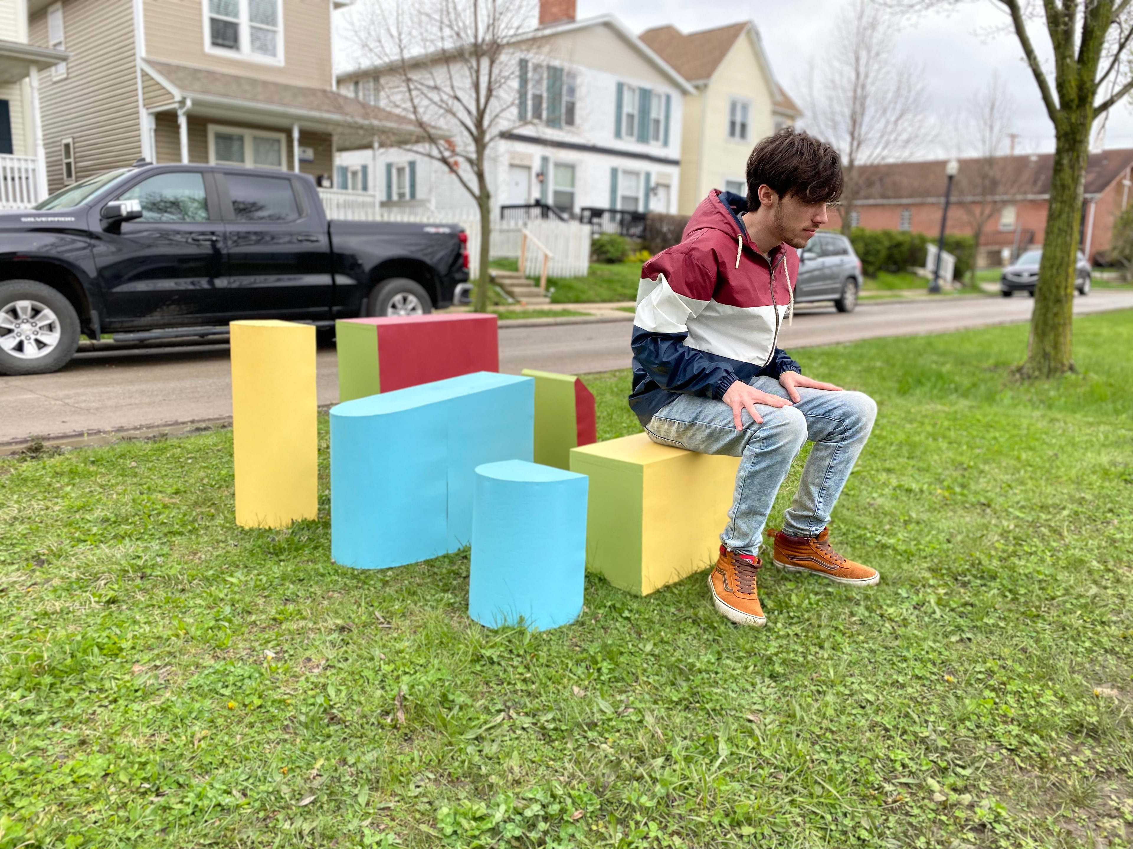
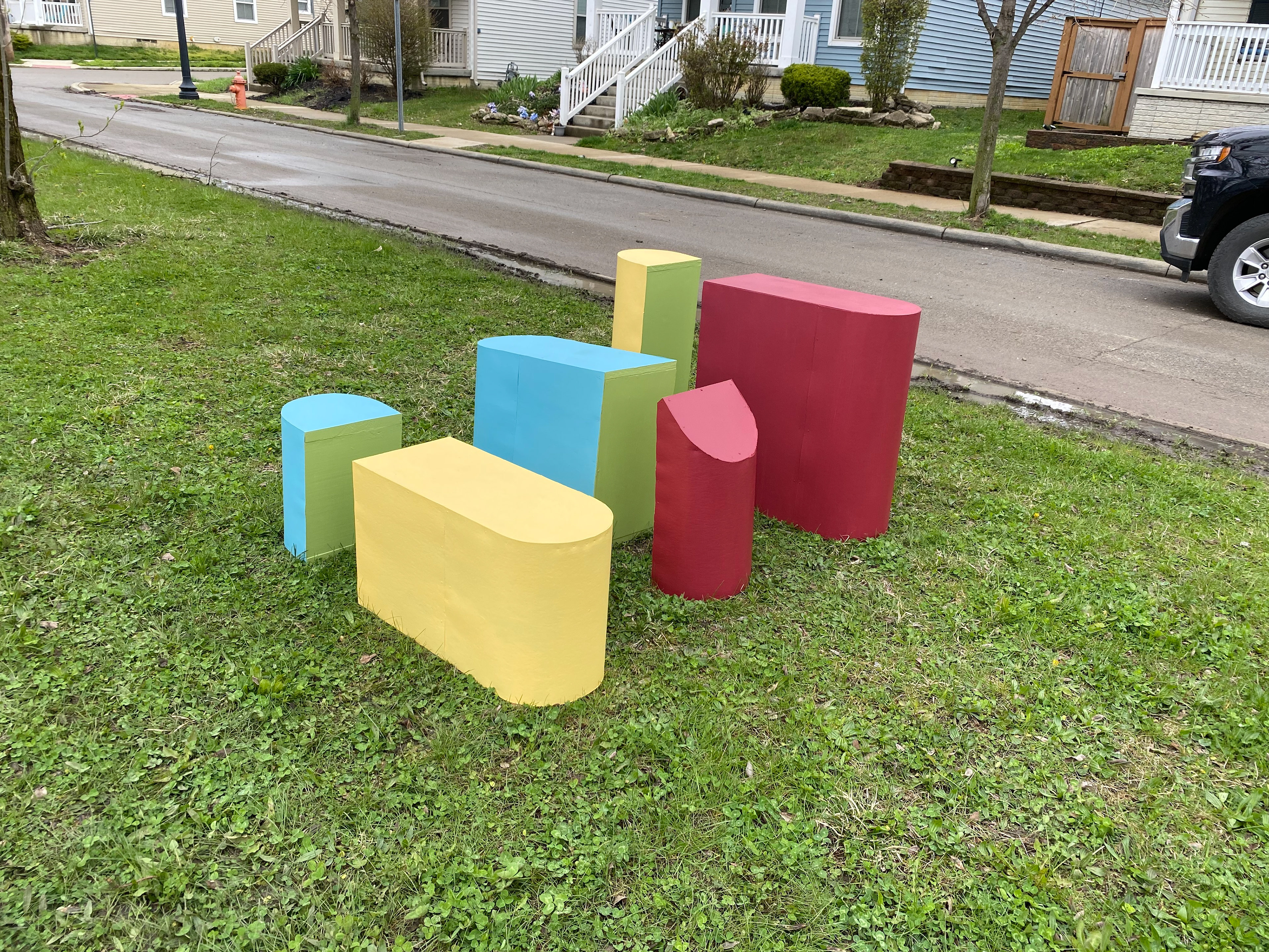
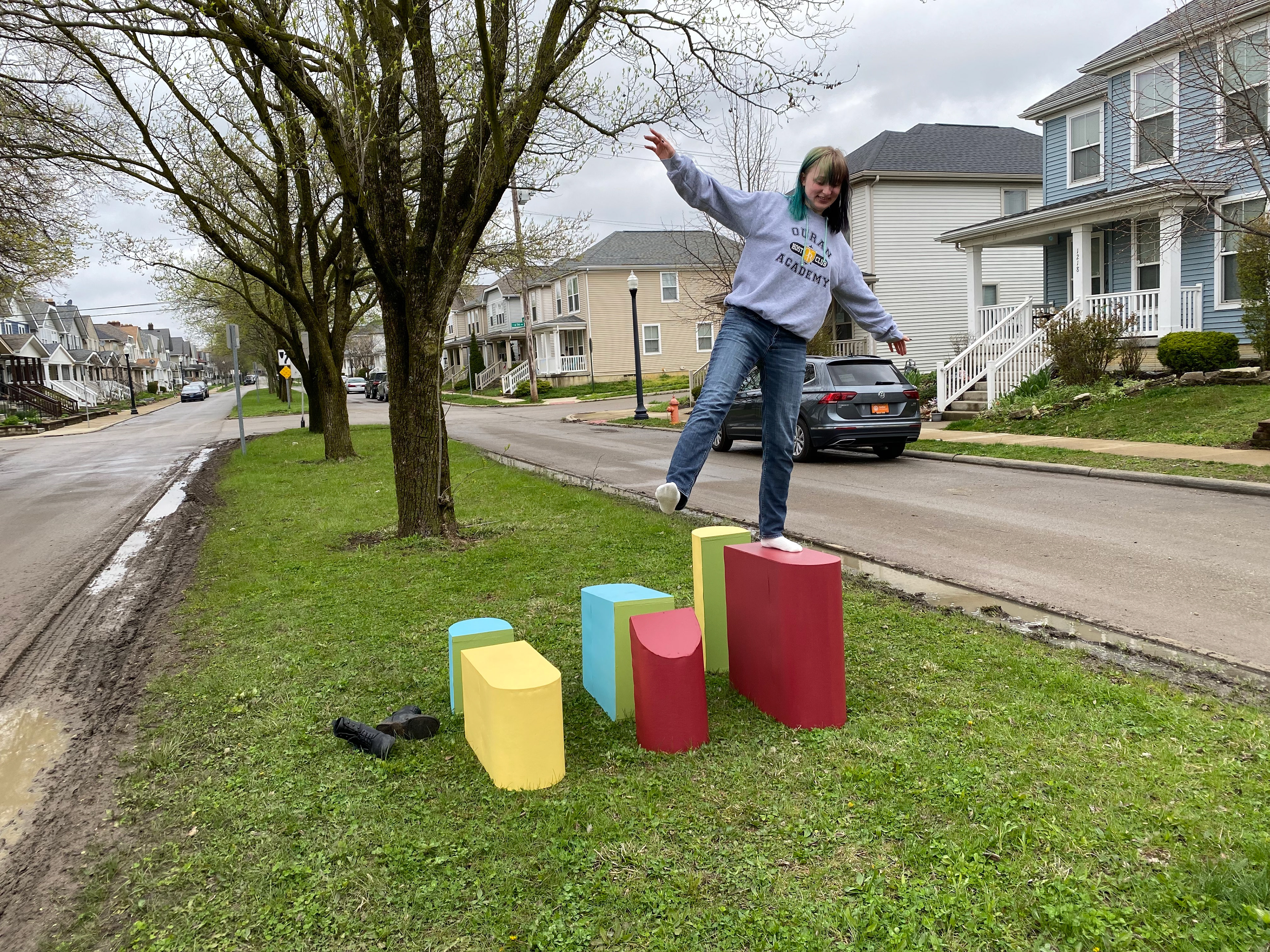
our final presentation was on site. We loaded up the steppers in my car and set them up in the median. We gave them a test ourselves to see how well they held up and if they provided a fun and comfortable experience. They passed.
in addition to the prototype we included a 3d rendered model of the entire system of beams and steppers in the space to scale.
