The project brief for this was to take and analyze the visual brand language of existing brands that had strong vbl. we were given a list of brands and we were told to chose one from that list and then we had to pick one not from that list. I chose Polaroid as my personal choice. I decided to focus on the slightly newer model of camera because as technology and time progresses so does the strength of the depth of vbl that polaroid understands and projects.
The second phase of this assignment was to take the visual elements and apply them to 2d thumbnail sketches of primitive shapes. Some of my favorite designs were ones that included the blueish lens and the rainbow, because I feel like those are some of the strongest elements that set polaroid apart. The subtle application of brand logo is a statement and I think it works. The big red button is a fun aspect as well.
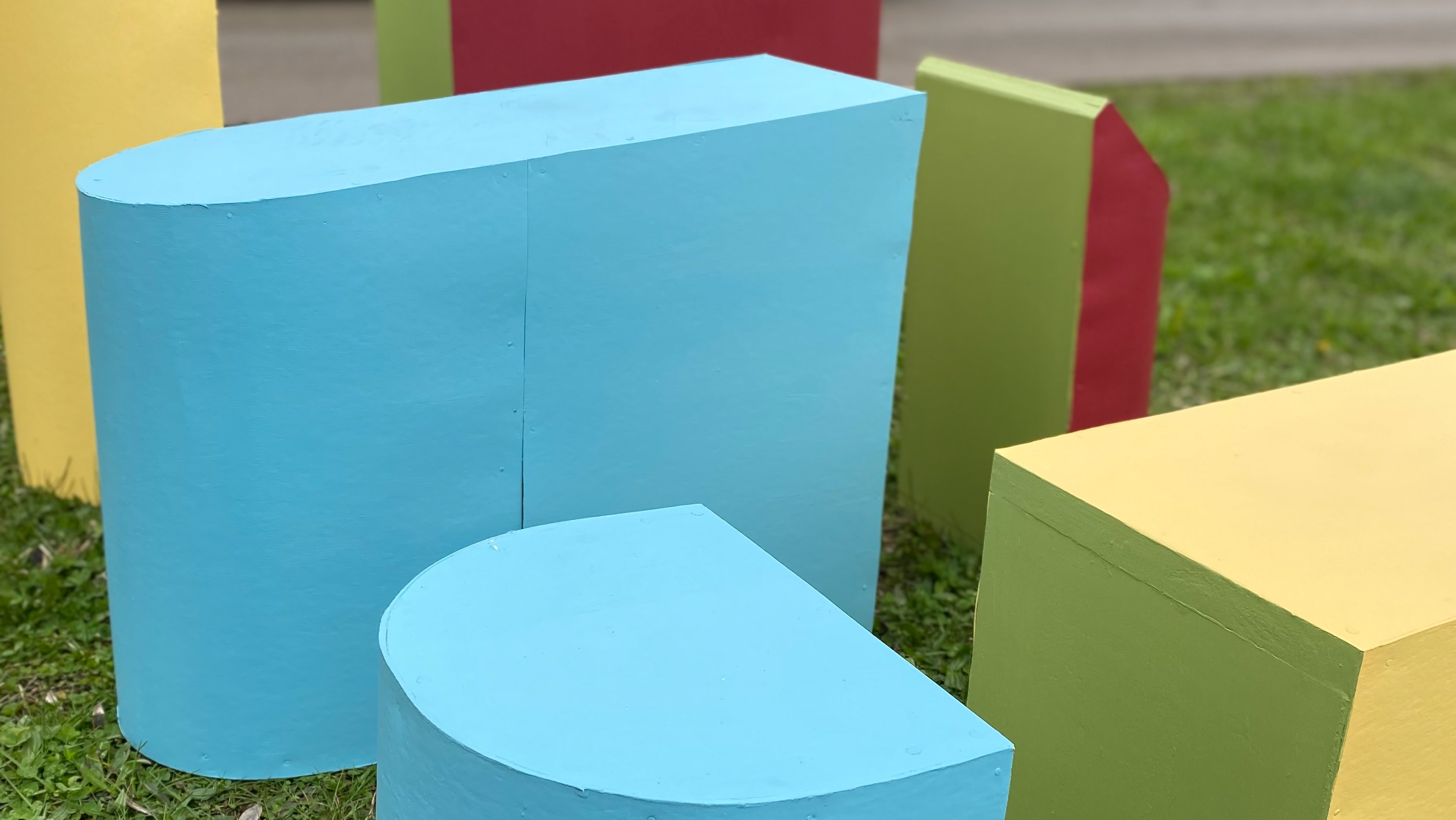
The 3rd phase was to take 3 of the 2d thumbnails and develop them into 3d shapes with higher fidelity. I chose these three shapes because i felt like they each captured the brand but in different ways. The 1st object executes on the softness of the overall shape but also has the cut aways and the stair stepping. In comparison the final object has a greater focus on the lens and the sleek design with the big red button and the joints in the plastic.
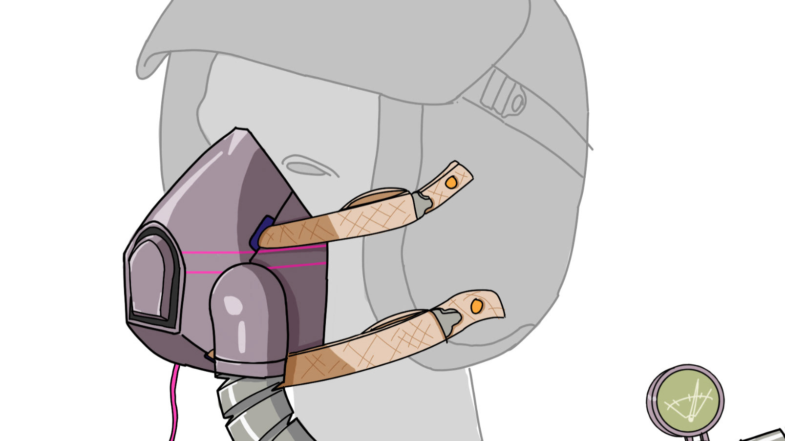
The main focus of this project boils down to the application of the vbl to existing products that are outside of brands current provision. We were directed to chose both a soft good and a hard good. we had to sketch over the existing images and analyze key features of those. Similarly with the original vbl products. I chose the motorcycle helmet and a sling bag.
With some sketching and ideation we had to produce 3 finalized designs for both the hard good and soft good. I am personally fond of 2nd bag, and the first helmet.
